So here's our pitch brochure, and our pitch presentation.
Brochure
http://www.scribd.com/doc/96121517/Balloon-Animals-Pitch
Presentation
http://www.scribd.com/doc/96121103/Presentation-1
Friday 8 June 2012
Wednesday 6 June 2012
ANOTHER Painting, and pitch tomorrow...

Monday 4 June 2012
Another Mood Painting
Got a couple more of these to get through, but I should be good. Today, it's the kids and their 'Balloons'.


Sunday 3 June 2012
Playing with 3D!
Todays adventures have been finalisation things for the pitch brochure. For the character pages, we're after renders of the 3D characters, as opposed to any drawn concept art, basically just to back up the fact the short will ultimately be 3D. My job is to sort out Jens pose, now after a fair bit of tinkering, just to get all her textures and geometry to play ball whilst rendering, I began posing.
 now, the lighting is no where near where I want it. I'm rubbish at lighting, i'll be the first to admit. AT the moment, I'm using a pre downloaded lighting rig SCott gave me, but we're all having problems, so tomorrow, we're meeting to build our own lighting rig, and sharing it for all 3 character renders.

Friday 1 June 2012
Sneak peak...
About our Pitch plan...
 The brochure is almost done, just got to tighten the presentation. This is the only hint i'm giving for now...

Thursdays progress.
final Stretch now, we pitch and hand in on wednesday 6th of June, so it's all hands on deck, tightening designs, finalising scripts, tweaking animatics. We're also working on the pitch brochure, and have a plan in mind, it should be memorable at least. I'm designing and assembling the brochure, whereas the boys are adding the written content. Images consist of various pieces of 3D and design work that we've all contributed.
Anyway, here's todays efforts.
 It was brought up in class about wether to keep the watch shot, due to issues having a watch on Nicks arm all through the short, amy cause rig issues. However, I see no problem in just having the watch for the one shot. After all, cartoons are FULL of inconsistencies like this, it's part of their charm. Go and watch any episode of Ren and Stimpy, Dexters Lab, or even The Simpsons, props are always appearing and dissapearing. And since we're going for that classic, almost 2D feel, I think we could easily get away with it. Plus, I think a Large comedy watch with LATE! written on it, is an effective visual cue.
 I also updated the colour script. We've added and chopped a lot of shots since the last script, and i felt the colour range needed expanding a little. Everything was a little too yellow. This version I think has more depth, and I've added the various colour cards we plan on using for key close up shots. Looking good. Anyway, I'm working on a nice post about colour scripts, which i'll finish and upload tomorrow.
Anyway, here's todays efforts.


Mood painting.
Threw together a mood painting, playing with light, colour, textures, all that jazz. ALso, will be a nice piece to include in any promo work and the pitch brochure we're working on.


Tuesday 29 May 2012
More fancy pants design work.
A bit of downtime from character work, I've been exploring some textures. I'm now apparently in charge of clouds, so lets start there...

For me, it's between numbers 3 and 5. Number 1, I used in my BA final project, 'Fetch!', so drawing that first just seemed natural.
 Next, Billy's wardrobe came into discussion. Now, we're not sure if we're going for a picture on his shirt yet, but I like the idea, so i explored it a bit. Plus it's a great chance to get another visual gag in there... My favourites are Corn, Screw Ball, and (lol) Beaver... The UFO does look cool though...

Finally, wood. I did a texture test for Scotts bench model last night, number 1 right there, but it looked a little too heavy on the model, maybe bump was set too high or something. Anyway, more exploration was needed. Scott has commented on liking number 5, but that looks a tad too boring to me. Perhaps I can find a happy medium somewhere between 5 and 1...
Anyway, more tomorrow, when character work will resume.

For me, it's between numbers 3 and 5. Number 1, I used in my BA final project, 'Fetch!', so drawing that first just seemed natural.


Finally, wood. I did a texture test for Scotts bench model last night, number 1 right there, but it looked a little too heavy on the model, maybe bump was set too high or something. Anyway, more exploration was needed. Scott has commented on liking number 5, but that looks a tad too boring to me. Perhaps I can find a happy medium somewhere between 5 and 1...
Anyway, more tomorrow, when character work will resume.
Monday 28 May 2012
Final Animatic! (hopefully!)
http://www.youtube.com/watch?v=5HmeVtoV9fk&feature=youtu.be
Here it is! Hopefully this'll be th one we work from, rearanged the order a bit on Chris' suggestion, and to SCott and K's re written script. Will find out in class tomorrow how it goes down!
Here it is! Hopefully this'll be th one we work from, rearanged the order a bit on Chris' suggestion, and to SCott and K's re written script. Will find out in class tomorrow how it goes down!
Sunday 27 May 2012
Mega design work update post!
Man am I terrible at keeping this thing up to date. After talking in class, I've been handed the position of doing some Character explorations. Since our leading lad and lady are pre defined rigs, I thought I'd better tackle the kids, Billy and Heather. We're going to be using the Morpheus rig for these two, so there will be some limitations as to what we can produce, but i see no reason in limiting myself on paper, might as well try every avenue, just incase you happen upon a mood or feature that could really work.

 First up, Billy. He's a typical 6 year old, loves dirt, ice cream, and just running around. As you can see, i started with some pretty unrealistic shapes, and refined from there. the fella with the finger up his nose is the direction we want to pursue I think.

 Then we have Heather. Younger than Billy, but loves play and ice cream just as much. Again, went through a similar process here, but i'm still not sure which direction to go, perhaps the little one with the balloon? I'll see where that takes me.
On a side note, I drew up a title card, just for fun. I think we could use it...


Went through a fair few title variations, but eventually landed on the final one. Yey old school!


On a side note, I drew up a title card, just for fun. I think we could use it...


Went through a fair few title variations, but eventually landed on the final one. Yey old school!
Thursday 24 May 2012
The beautiful, and almost forgotten world of title cards.
I love title cards. Those wonderful paintings at the beginning of a film or cartoon, maybe shown for just a few seconds. They can do everything from set the mood of the film you are about to view, offer eye candy whilst production credits roll out, or even mislead the audience entirely, but boy, are they pieces of art! Here just a few of my favourites, sourced from around the internet.
Adventure Time with Finn and Jake - Frederator Studios


 Ren and Stimpy - Spumco/ Games Animation


Ed, Edd, n Eddy - Studio AKA/ Cartoon Network


Adventure Time with Finn and Jake - Frederator Studios


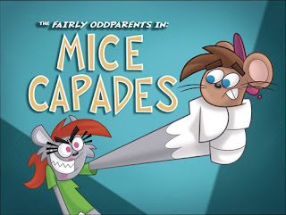
Fairlyodd Parents -Frederator Studios


Ed, Edd, n Eddy - Studio AKA/ Cartoon Network


Wednesday 23 May 2012
New animatic and Colour Script
Right, chopped and re did the beginning on peoples suggestions, and also drew up a nifty colour script. I still think the colour script is lacking some what, a bit too, bright, over saturated, lacks depth. I'll tweak it tomorrow. Also, I managed to get hold of all the production music used in cartoons like Ren and Stimpy (which I've been watching way too much of since I acquired the DVD box sets...), and more recently SpongeBob Squarepants, I just had to use it in the animatic...
Looking good! But tomorrows class feedback will ultimately decide where to take it from here...
And the colour script.

And the colour script.

Scripts and Animatics.
Last night, we received even more feedback from Ed Hooks, regards our latest script re write.
"Much stronger, Kristian.
Suggestions:
1. On Nicholas's first appearance, we don't need to hear his conversation with his mate. In fact, it will be better if we do not. You can have him saying exactly the same thing he is now, about the girl last night who was all over him, just replace his recorded dialogue with music or something. Everything else is the same. Sees the girl, tells his mate he has to run, gets off the phone.
2. After he gets off the phone, have him go straight for Jen. On the way, he has to step over a small flower garden that runs parallel to the sidewalk. As he steps over, he gets the idea to give her flowers. We don't have to see him pick them. He only has to get the idea, the impulse to pick them. Animate his thoughts.
3. I don't like his first line to Jen. You aren't using it to expose any of Nicholas's personality or values. This is the kind of guy that troops around with rubbers in his pocket, and I think he might go for a grandiose intro. Bowing to the queen, over-acting, hoping to amuse and charm her. But "These are for you" is lame.
4. Jen's reaction to him is too ambivalent. Does she think he's funny? Hot looking? A pushy jerk? With "ehhh….thanks…I guess", you are again wasting an opportunity to expose values and personality. This is, in general, something you guys need to work on, using every single moment of action and dialogue to expose new information about the characters and story. Time restriction is part of the discipline of telling stories on film. Make everything count. The audience will presume that 100 percent of what they see on screen is important, even the tiniest thing.
5. As you have it now, Jen does not react favorably to Nicholas at all. After she discovers that he made the balloon thing for the kid, she briefly reconsiders her reaction, but that does not change anything. What is HER objective? Why is she sitting on the bench in the first place? Give her something to do. How about if she is an artist and is sketching park scenes on a pad? It could be funny if she is sketching the flowers when Nicholas picks them, ruining her sketch. <g> Once he presents the flowers to her and sits down, she still needs an objective. Using the artist thing, maybe she is working on a project and has a deadline. She is amused and charmed by Nicholas, but she has work to do. Something like that. Anything, really. Just don't have her sort of sitting there doing nothing except reacting to him.
6. After Nicholas says the corny line about Tennessee, you have her sliding down the bench. That is not strong enough. If she really wanted to get away from him, she would get up and leave. Unless she has some other reason for sitting there. And, once again, I would prefer to see her amused by his corny joke, even while trying not to let him see her amusement.
7. The boy, his sister, the ice cream and the balloon have no reason for being in this story other than to set up the joke about the condom. If I were you, I would get rid of the kids because they are not advancing the story enough to keep them there. If you absolutely, positively must have Jen see a condom or condom wrapper, then let him maybe reach in his pocket to get something -- chewing gum, change for ice cream, a picture of his dog, his driver's license -- and as he does that, the condom falls out onto the ground. Unopened. Part of the problem you have is that the audience is having to deal with the rubber and the wrapper it came in. Plus, you have Nicholas being a litterer, which is a turn-off for Jen. Imagine if Charlie Chaplin accidentally dropped a condom in front of somebody he was trying to impress…. What would he do? I will bet he would try to quickly hide it, putting his shoe on top of it or trying to kick it under the bench, all the while trying to straighten up the flowers on the bench.
8. And, finally, I personally would prefer to see him succeed a little at the end. Once she sees the condom, she makes a hasty exit. Maybe she looks back over her shoulder and sees that he is embarrassed. So she turns around and goes back to the bench. Or something. I am talking out of my ass here. This is not a concrete suggestion. All I'm saying is that the condom joke is taking too long to set up, involves too many characters and is going to put your audience in an awkward position.
Ed"
A lot of stuff to think on. But I think consensus within the group, and with tutors, is to keep the current ending. It seems to work in animatic form. PLus, in fairness, we could edit, and edit, and edit, all year, but time is short. Best add a few little tweaks and move on.
Here's the above mentioned animatic, still awaiting sound.
Feedback in class was good! Laughs were had in the right places, and the ending was liked by all. We discussed changing the beginning, basically chopping out the flower stall and wallet parts, as they added no real value to the story, only took up time. So, off I go to chop!
"Much stronger, Kristian.
Suggestions:
1. On Nicholas's first appearance, we don't need to hear his conversation with his mate. In fact, it will be better if we do not. You can have him saying exactly the same thing he is now, about the girl last night who was all over him, just replace his recorded dialogue with music or something. Everything else is the same. Sees the girl, tells his mate he has to run, gets off the phone.
2. After he gets off the phone, have him go straight for Jen. On the way, he has to step over a small flower garden that runs parallel to the sidewalk. As he steps over, he gets the idea to give her flowers. We don't have to see him pick them. He only has to get the idea, the impulse to pick them. Animate his thoughts.
3. I don't like his first line to Jen. You aren't using it to expose any of Nicholas's personality or values. This is the kind of guy that troops around with rubbers in his pocket, and I think he might go for a grandiose intro. Bowing to the queen, over-acting, hoping to amuse and charm her. But "These are for you" is lame.
4. Jen's reaction to him is too ambivalent. Does she think he's funny? Hot looking? A pushy jerk? With "ehhh….thanks…I guess", you are again wasting an opportunity to expose values and personality. This is, in general, something you guys need to work on, using every single moment of action and dialogue to expose new information about the characters and story. Time restriction is part of the discipline of telling stories on film. Make everything count. The audience will presume that 100 percent of what they see on screen is important, even the tiniest thing.
5. As you have it now, Jen does not react favorably to Nicholas at all. After she discovers that he made the balloon thing for the kid, she briefly reconsiders her reaction, but that does not change anything. What is HER objective? Why is she sitting on the bench in the first place? Give her something to do. How about if she is an artist and is sketching park scenes on a pad? It could be funny if she is sketching the flowers when Nicholas picks them, ruining her sketch. <g> Once he presents the flowers to her and sits down, she still needs an objective. Using the artist thing, maybe she is working on a project and has a deadline. She is amused and charmed by Nicholas, but she has work to do. Something like that. Anything, really. Just don't have her sort of sitting there doing nothing except reacting to him.
6. After Nicholas says the corny line about Tennessee, you have her sliding down the bench. That is not strong enough. If she really wanted to get away from him, she would get up and leave. Unless she has some other reason for sitting there. And, once again, I would prefer to see her amused by his corny joke, even while trying not to let him see her amusement.
7. The boy, his sister, the ice cream and the balloon have no reason for being in this story other than to set up the joke about the condom. If I were you, I would get rid of the kids because they are not advancing the story enough to keep them there. If you absolutely, positively must have Jen see a condom or condom wrapper, then let him maybe reach in his pocket to get something -- chewing gum, change for ice cream, a picture of his dog, his driver's license -- and as he does that, the condom falls out onto the ground. Unopened. Part of the problem you have is that the audience is having to deal with the rubber and the wrapper it came in. Plus, you have Nicholas being a litterer, which is a turn-off for Jen. Imagine if Charlie Chaplin accidentally dropped a condom in front of somebody he was trying to impress…. What would he do? I will bet he would try to quickly hide it, putting his shoe on top of it or trying to kick it under the bench, all the while trying to straighten up the flowers on the bench.
8. And, finally, I personally would prefer to see him succeed a little at the end. Once she sees the condom, she makes a hasty exit. Maybe she looks back over her shoulder and sees that he is embarrassed. So she turns around and goes back to the bench. Or something. I am talking out of my ass here. This is not a concrete suggestion. All I'm saying is that the condom joke is taking too long to set up, involves too many characters and is going to put your audience in an awkward position.
Ed"
A lot of stuff to think on. But I think consensus within the group, and with tutors, is to keep the current ending. It seems to work in animatic form. PLus, in fairness, we could edit, and edit, and edit, all year, but time is short. Best add a few little tweaks and move on.
Here's the above mentioned animatic, still awaiting sound.
Sunday 20 May 2012
Research and Developement.
Some more working updates.


Back when we were still entertaining the idea of having our couple meet at Jen's apartment, we decided we wanted a more homely feel, rather than the generic, new York apartment designs I posted last time. More of a large townhouse. I took a face design for an apartment, and built it up into a house. Something not too dissimilar to Stewart Little's town house, from the film of the same name.

However, since our last script re write, we've omitted the apartment scene. Been cracking on with research in other areas too, collected some sample images for park ideas, just for something to base some background art for the Animatic at the moment, Kristian is heading the park designs as I write this.

I'll be moving on to a colour script once I finish the Animatic, and the varying light qualities shown in the above selection of images will surely help. Another, somewhat less savoury port of call for research was for the star of the film, the condom balloon.

Honestly? I envisioned a longer result, maybe I need to try some different varieties? Anyway, a longer ballon will defiantly create more comedy on screen, at least in my eyes... As I'm putting our Animatic together, I'm really exploring the Nick characters facial expressions. Now, we'll be using the old Malcolm rig, that I used for the first 2 modules of this course, and that rig has an amazingly expressive face, so I'm going to try my damnedest to push it.

Hopefully I'll have an Animatic for you all tomorrow.
Back when we were still entertaining the idea of having our couple meet at Jen's apartment, we decided we wanted a more homely feel, rather than the generic, new York apartment designs I posted last time. More of a large townhouse. I took a face design for an apartment, and built it up into a house. Something not too dissimilar to Stewart Little's town house, from the film of the same name.
However, since our last script re write, we've omitted the apartment scene. Been cracking on with research in other areas too, collected some sample images for park ideas, just for something to base some background art for the Animatic at the moment, Kristian is heading the park designs as I write this.
I'll be moving on to a colour script once I finish the Animatic, and the varying light qualities shown in the above selection of images will surely help. Another, somewhat less savoury port of call for research was for the star of the film, the condom balloon.
Honestly? I envisioned a longer result, maybe I need to try some different varieties? Anyway, a longer ballon will defiantly create more comedy on screen, at least in my eyes... As I'm putting our Animatic together, I'm really exploring the Nick characters facial expressions. Now, we'll be using the old Malcolm rig, that I used for the first 2 modules of this course, and that rig has an amazingly expressive face, so I'm going to try my damnedest to push it.
Hopefully I'll have an Animatic for you all tomorrow.
Subscribe to:
Posts (Atom)